We audited 5,156 of 5,410 live Shopify stores across 1,277 niches, and only 254 came back clean. That is 4.9%. The average store carried 2.85 fixable conversion issues. Put plainly: roughly 95 out of every 100 stores we looked at are leaving money on the table before a single ad dollar runs.
None of these are exotic bugs. They are the same handful of mistakes repeating across vegan skincare, craft coffee, matcha, handmade soap, and dog accessory brands. Different products, identical leaks.
One more time on the honesty bar, because it matters. This is a build-side audit of front-end conversion signals: layout, page speed, trust cues, and calls-to-action. It is not a traffic or revenue dataset. Shopify conversion rate optimization gets sold as a black box, and it should not be one.
Here is the ranked list of what we found, so you can skip to your own problem:
Each finding below gets its own fix, drawn from stores we have shipped. If you want context on who ran this, meet the Shopify experts in Toronto behind the numbers. If you already know something is broken, our Shopify build and CRO services are where we do the repair work. Start reading at your worst offender.
The 8 most common Shopify conversion mistakes
Ranked by share of the 5,156 audited stores.
| # | Conversion mistake | Share of stores | % | Stores |
|---|---|---|---|---|
| 1 | Add-to-cart below the fold (mobile) | 74.8% | 3,857 | |
| 2 | No free-shipping threshold prompt | 68.3% | 3,523 | |
| 3 | Slow homepage (non-lazy images) | 39.6% | 2,041 | |
| 4 | No trust cues near the buy button | 38.9% | 2,008 | |
| 5 | No clear call-to-action above the fold | 28.1% | 1,447 | |
| 6 | No visible reviews or social proof | 17.6% | 905 | |
| 7 | Weak or missing value proposition | 12.6% | 652 | |
| 8 | No on-site search on homepage | 5.3% | 271 |
Add-to-cart sits below the fold on mobile
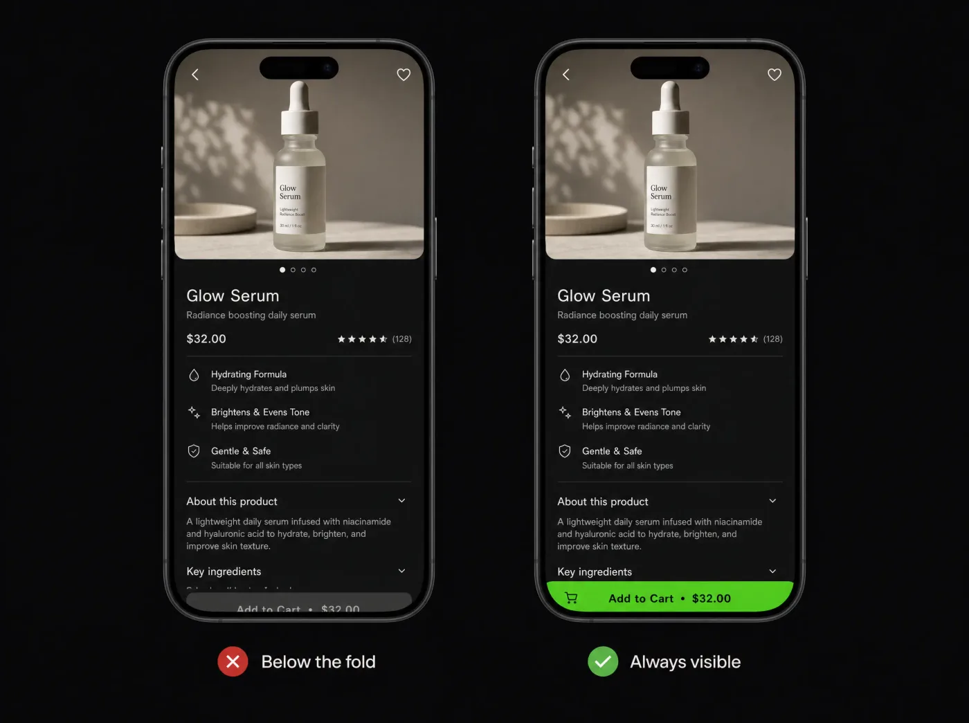
74.8% of stores (3,857 of them) push the add-to-cart button below the first mobile screen. The one action that makes you money is hidden on load, and shoppers have to scroll and hunt to find it.
Here is why that costs sales. Most Shopify traffic is mobile, and mobile attention is short. Every extra scroll before the buy button is another chance for the visitor to bounce, get distracted, or forget the price they came to check. We have watched session recordings where people thumb past the buy zone, land in the reviews, and leave without ever seeing "Add to cart." The intent was there. The button was not.
The fix we ship is a sticky add-to-cart bar. It pins to the bottom of the screen and stays put as the shopper scrolls, so the buy action is always one tap away. We pair the sticky bar with a cleaner product template: price and variant selectors moved up, image gallery tightened, so the first mobile screen carries the decision instead of burying it.
The theme angle matters here. The top theme in our data is Dawn, and Dawn does not pin add-to-cart out of the box. So this hits stock installs hardest, and a default Dawn store almost always has this problem until someone fixes it.
If you want it built properly, this is core to our Shopify build and CRO services. And if you are weighing a quick template tweak against a purpose-built product page, read theme vs custom design before you decide. A sticky bar is a small change with a real return. Most stores can ship it this week.
No free-shipping threshold prompt
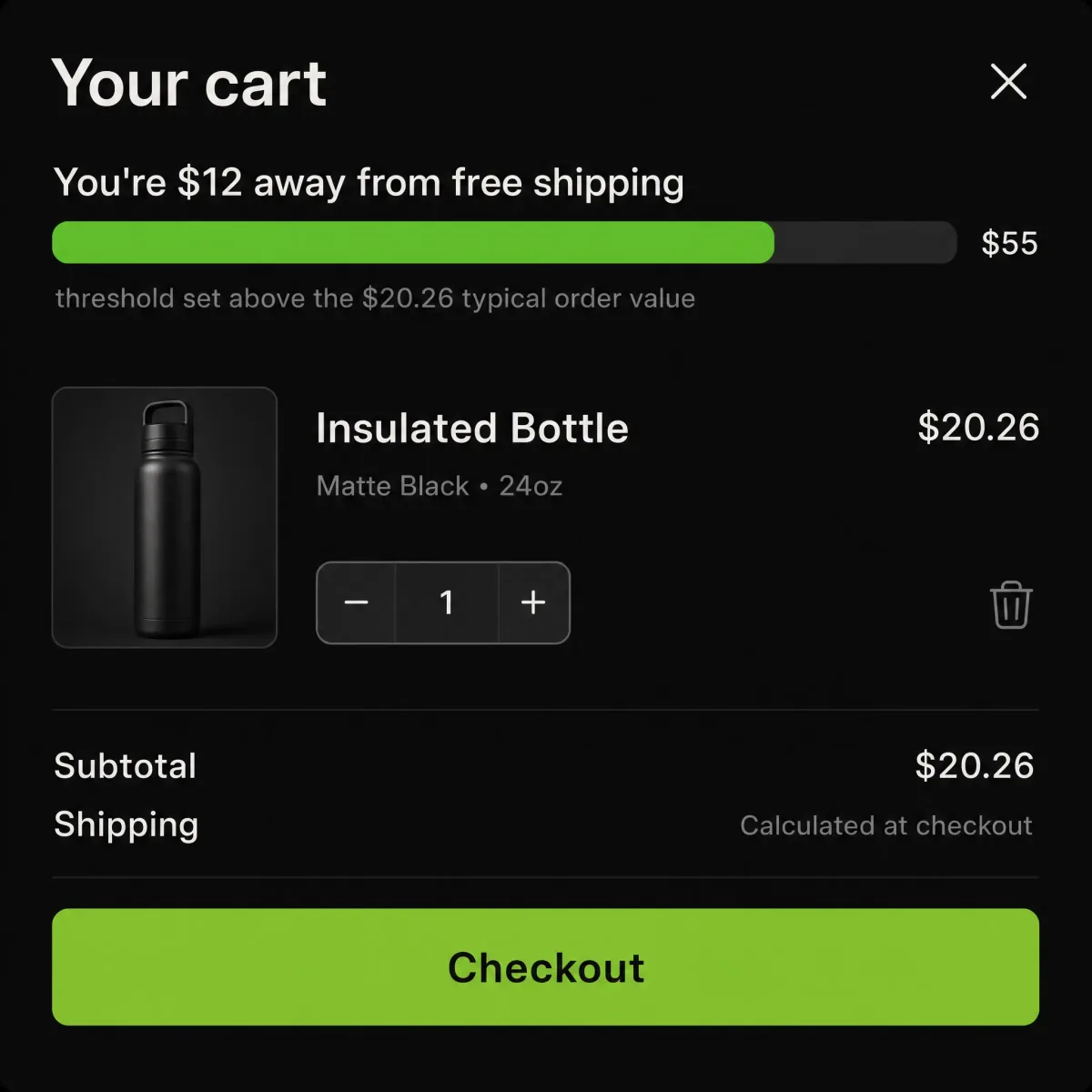
68.3% of the stores we audited (3,523 of them) never tell a shopper how close they are to free shipping. That is 3,523 stores leaving the cheapest average-order-value lever untouched, and it is the single easiest fix in this whole report.
Here is the psychology, kept simple. A cart with a message like "You're $12 away from free shipping" gives the shopper a reason to add one more item, and they do it without a discount code. You keep your margin. They feel like they won something. Compare that to silence, where the shipping cost shows up as a surprise at checkout and the cart gets abandoned. A visible free shipping bar turns that friction into a small, winnable game.
The fix we ship is a dynamic progress bar that lives in two places: the sticky header and the cart drawer. It updates as items go in, counts down the remaining spend, and ties to a threshold set just above a store's typical order value. A static "Free shipping over $X" banner does not move the needle. The live count does.
Where to set the number matters. Across these stores the typical entry price sits around $20.26, so a single item rarely clears a threshold on its own. That is the point. Set the bar around $50 to $60 and most carts land one item short, which is exactly the nudge you want. Too high and shoppers give up. Too low and everyone qualifies, so the mechanic does nothing.
We handle this kind of cart and AOV work as part of our Shopify build and CRO services. Want the numbers for your own store first? Book a store audit and we will map it against your real order data.
Slow homepage from images that never lazy-load
39.6% of the stores we audited (2,041 of them) likely serve a slow homepage because too many images render eagerly instead of lazy-loading below the fold. When we run a Shopify speed optimization pass, this is the most common thing we find hiding under a decent-looking theme.
Here is why it costs you money. A slow first paint means shoppers stare at a blank or half-built page while your product images fight to load all at once. Many bounce before they see a single product. If you are paying for that traffic, your ad spend leaks out the top of the funnel, and no offer downstream can win back a visitor who already left.
The fix is not exotic. We lazy-load every offscreen image so the browser only fetches what is actually in view. We serve WebP or AVIF at the correct dimensions instead of a 3000px hero squeezed into a 600px slot. We defer non-critical scripts (apps, chat widgets, tracking) so they stop blocking the first render. Together those moves protect your Core Web Vitals (LCP, CLS, INP), which is the same signal Google rewards in ranking.
One more gap worth naming: 30.2% of stores ship no structured data at all. That means Google cannot read your products, prices, or reviews cleanly, so you lose rich results in search. We fix it in the same pass, because there is no reason to touch the theme twice.
If your homepage feels sluggish, this is fixable work. See our technical SEO and Core Web Vitals service for the speed and schema side, and our Shopify build and CRO services for the build itself. Prefer to see the numbers on your own store first? Book a store audit and we will show you exactly what is loading eagerly.
No shipping, returns, or guarantee reassurance near the buy button
38.9% of stores (2,008) show no shipping, returns, or guarantee messaging near the buy decision. So a first-time buyer, ready to commit, hesitates at the exact moment we needed them to click. They scroll up. They open a new tab. They leave.
Here is the honest version of what trust badges are for. It is not a wall of generic logos or a "100% secure" seal nobody reads. It is answering the three questions a nervous buyer is actually asking. When will it arrive. Can I send it back. What happens if it breaks. Miss those, and every other thing you did to earn the click gets wasted at the finish line.
We audited 5,156 stores, and this pattern is one of the most common conversion leaks we see on product pages. The buyer has intent. The page just went quiet at the worst possible second.
The fix we ship is small and fast:
- A concise reassurance line directly under the add-to-cart button (shipping speed, free return window).
- The same messaging repeated in the cart, where second-guessing spikes.
- A short returns and guarantee snippet on the product page, written in the brand's voice, not boilerplate.
For Toronto and Canadian stores there is a bonus. Clear local shipping and returns copy reads as a trust signal to buyers and a relevance signal for local search, so it is a quick win on both conversion and ranking. We build this as part of our Shopify build and CRO services, and if you want to know who is behind the numbers, meet the team behind the audit. This is the kind of detail that separates a page that converts from one that just looks finished.
No clear call-to-action above the fold
28.1% of stores (1,447) give the shopper nothing obvious to click above the fold. The first screen loads, and it sets no direction. No "Shop now," no bestseller, no collection link with any weight to it. The visitor lands on a pretty hero image and then has to decide, on their own, what to do next.
That decision costs you sales. When the hero has no primary button, you are asking a first-time visitor to do your merchandising for you. Most will not. They scroll a little, hesitate, and leave. If you want to increase your Shopify conversion rate, the fastest lever is often the simplest one: tell people where to go the moment they arrive.
The fix we ship is one primary above-the-fold CTA with real contrast. Not a faded ghost button that blends into the background. Something like "Shop the bestseller" or "Shop the collection," sized and colored so it is the first thing the eye lands on. One button, one job. We route it to whatever actually converts: your top product, your hero collection, or a seasonal drop.
This pairs with a related finding. 12.6% of stores (652) also run a weak or missing value proposition up top. So the hero fails on both message and action: the shopper does not know what you sell, and does not know what to press. Fix both together. State the promise in plain words, then give one clear thing to click.
See the Shopify stores we have shipped for hero rebuilds in action, and our Shopify build and CRO services for how we approach the work end to end.
Weak or missing value proposition
12.6% of stores (652) never say what they actually sell, or why it is worth buying from them. The hero loads with a mood shot and a word like "Elevate" or "Discover," and a first-time visitor still cannot answer the only question they arrived with: what is this, and is it for me?
This is the quietest of the eight leaks, which is exactly why it survives. Nothing looks broken. The page is pretty, it loads, the buttons work. But a visitor who cannot place you in five seconds does not argue with the page, they just leave, and your analytics record it as a bounce rather than as a message that went missing.
It also compounds with the mistake above it. A store with no clear call-to-action AND no clear promise fails on both halves of the first screen: the shopper does not know what you sell, and does not know what to press. Where we find both, we fix them as one job rather than two.
Here is what we ship to fix it:
- A plain-language headline that names the product category, not a mood.
- One line underneath carrying the specific reason to buy here: the ingredient, the guarantee, the shipping promise, the thing a competitor cannot copy.
- Three short proof points near the fold, pulled from what the brand can actually defend.
The test we use is blunt. Show the first screen to someone who has never seen the brand, give them five seconds, then ask what the store sells and who it is for. If they cannot answer, the hero is decoration. We rebuild heroes against that test as part of our Shopify build and CRO services.
No on-site search on the homepage
5.3% of stores (271) give the shopper no way to search from the homepage. It is the rarest failure in the audit, and on a ten-product catalogue it barely matters. On a catalogue with depth it is expensive, because the people who search are the people who already decided to buy something.
Searchers convert at a far higher rate than browsers, for an obvious reason: typing a product name is an act of intent. Someone idly scrolling a collection may or may not be shopping. Someone typing "magnesium glycinate" has a wallet out. Hiding the search field, or burying it behind an icon nobody taps, pushes your highest-intent visitors back into browsing and hopes they find it themselves.
Here is what we ship to fix it:
- A visible search field in the header on desktop, and a tap target that reads as search on mobile, not an unlabelled icon.
- Predictive results with product thumbnails and prices, so the answer appears while they type.
- A results page that handles misspellings, synonyms, and empty states with a real suggestion instead of "no results found."
Search is also a free research channel most stores never read. The queries your visitors type are a list of what they want and could not find, in their own words. We wire the query log into analytics so it feeds merchandising decisions, not just the search box. See how we approach catalogue work across Shopify stores we have shipped.
How we audited 5,410 Shopify stores (methodology)
We ran an automated front-end Shopify store audit against 5,410 live storefronts and cleanly analyzed 5,156 of them across 1,277 distinct niches. Only 254 came back clean. That gap is the whole story: the average store tripped 2.85 of our checks, and the mistakes repeat across categories from vegan skincare to craft coffee.
Here is exactly what we checked on every store, first-load, as a shopper sees it:
- Mobile add-to-cart position (is the buy button above the fold?)
- Free-shipping threshold prompts
- Image lazy-loading and homepage speed signals
- Trust messaging near the buy decision (shipping, returns, guarantees)
- Above-the-fold CTA and value proposition
- Visible product reviews and social proof
- On-site search on the homepage
Why this matters: every one of these signals sits between a visitor and a checkout. When they are missing, you lose the sale before the shopper ever forms an intent, and no amount of ad spend fixes a homepage that hides the buy button.
Now the limits, stated plainly. We measured public front-end signals, not backend analytics and not actual conversion rates. We cannot see your Shopify reports, so we do not claim to. A store counted as "clean" only when it tripped none of our checks, which is why just 254 of 5,156 qualified. Treat this as a directional map of where money leaks, not a substitute for your own numbers.
For context on where these mistakes cluster: 30.5% of stores run no blog, 5.3% have no homepage search, and Dawn was the most common theme by a wide margin. A shared default theme means shared default gaps, which is why the same issues surface store after store.
The research was run by EVDEV, and led by Misha Gavura, Co-founder and CTO. The team behind the audit are Shopify experts in Toronto who ship these fixes for a living. Want the same checks run on your storefront? Book a store audit and we will send the findings.
What the best 4.9% of Shopify stores do differently
Only 254 stores came back clean (4.9%), and not one of them won by being fancier. We audited 5,156 Shopify stores across 1,277 niches, and the top performers simply closed the same eight gaps everyone else left open. Their buy button was reachable, fast, trusted, and obvious. That is the whole trick.
Here is why the gaps cost sales. When add-to-cart sits below the fold on mobile (true for 74.8% of stores), shoppers scroll, lose the thread, and leave. When there is no free-shipping prompt, no reviews near the price, and no word on returns, people hesitate at the exact second they were ready to pay. Hesitation is lost revenue.
So if you want to know how to improve Shopify conversion rate without a redesign, run this punch list:
- Sticky add-to-cart on mobile, visible at all times
- A free-shipping progress bar ("You're $12 away from free shipping")
- Lazy-loaded images so the homepage paints fast
- Trust lines (shipping, returns, guarantee) right beside the buy button
- One clear hero CTA above the fold, not five
- Visible product reviews and social proof
Now the part most owners miss. The average store carries 2.85 issues, not twenty. Fix three things and you usually move a store from average to clean. This is not a rebuild. It is an afternoon of focused work on pages that already get traffic.
This is the same punch list we run for clients as Shopify experts in Toronto, and it feeds straight into our Shopify build and CRO services. Want your number? We will check your store and tell you how many of the eight you are missing, for free. Book a store audit, or browse the Shopify stores we have shipped.
What the top 4.9% do
- Sticky add-to-cart on mobile
- Free-shipping progress bar
- Lazy-loaded images for fast paint
- Trust lines beside the buy button
- One clear hero CTA
- Visible product reviews
Key findings
- We audited 5,410 live Shopify stores across 1,277 niches. Only 254 (4.9%) were clean.
- The average store carried 2.85 fixable conversion issues, so 95% leak sales before any ad spend.
- The most common mistake by far: 74.8% of stores (3,857) hide add-to-cart below the fold on mobile.
- 68.3% of stores never show a free-shipping progress prompt, the cheapest average-order-value lever there is.
- 39.6% likely load a slow homepage from images that render eagerly instead of lazy-loading.
- Dawn was the top theme, and it does not pin add-to-cart out of the box, so default installs share the same gaps.
- Most stores carry only 2.85 issues, so fixing three things often moves a store from average to clean without a redesign.

Want to know your store’s number?
Have a question about the study, or want to know your own store's number? Talk to Misha Gavura, Co-founder and CTO of EVDEV. He led this audit, and he is happy to look at your storefront and tell you straight which of the eight gaps you are carrying, what they are costing, and what is worth fixing first. No pitch deck, no pressure. Just a practitioner who has shipped hundreds of Shopify stores looking at yours. Book a store audit and we will send the findings back to you.
Misha G. replies within 2 hours.
The bottom line
Ninety-five percent of the stores we looked at are leaking sales, and almost always for the same few reasons. That is the frustrating part and the good part at once. Frustrating, because the mistakes are so common. Good, because they are known, small, and fixable. The average store carried 2.85 issues, not a broken foundation. You do not need a rebuild. You need the buy button reachable, the page fast, the buyer reassured, and one clear thing to click. Run the punch list, start with your worst offender, and close the gap the top 4.9% already closed.
Frequently asked questions
What is the average conversion rate on Shopify?+
Our study did not measure conversion-rate percentages. We audited front-end conversion mistakes across 5,410 stores, not their analytics. For the actual metric, most public Shopify benchmarks put the average storefront conversion rate somewhere around 1% to 3%, with strong stores pushing higher. Treat any single figure as a rough range, then focus on the fixable issues on your own pages.
Why is my Shopify store getting traffic but no sales?+
Traffic without sales usually means the page fails at the moment of decision. In our audit the top culprits were a hidden mobile add-to-cart button (74.8% of stores), no trust or returns copy near the price (38.9%), and no reviews (17.6%). Visitors arrive with intent and then hit friction right before checkout. Fix the buy zone first.
Why is my Shopify store not converting even with good products?+
Good products still lose sales when the page buries the decision. We found the average store tripped 2.85 basic checks: add-to-cart below the fold, no free-shipping nudge, slow images, thin trust cues. Shoppers rarely blame the product. They just leave when the path to buy is unclear or slow. Close those gaps and conversions usually move.
Do trust badges actually increase conversions on Shopify?+
Yes, when they answer real buyer questions rather than showing generic seals. What works is a short line near the add-to-cart button covering shipping speed, the return window, and any guarantee. In our audit 38.9% of stores had no reassurance near the buy decision at all, so this is often a fast, high-impact fix on the product page.
Should the Add to Cart button be above the fold on mobile?+
Yes. In our audit 74.8% of stores (3,857) pushed add-to-cart below the first mobile screen, the single most common mistake we found. Most Shopify traffic is mobile, and every extra scroll before the buy button loses shoppers. We fix it with a sticky add-to-cart bar that stays pinned as the shopper scrolls.
Does page speed affect my Shopify conversion rate?+
Yes. A slow first paint makes shoppers bounce before they see a product, and if you are paying for traffic that spend leaks out the top of the funnel. In our audit 39.6% of stores likely loaded slowly because images rendered eagerly instead of lazy-loading. Speed also feeds Core Web Vitals, which affects Google ranking.
How do I add a free shipping bar in Shopify?+
Add a dynamic progress bar in the header and cart drawer that counts down the spend left to reach free shipping, tied to a threshold set just above your typical order value. A static banner does little; the live count is what nudges a second item into the cart. In our data 68.3% of stores had no prompt at all.
How much does a Shopify store audit cost?+
We run the same eight-point front-end audit from this study on your storefront for free and tell you how many issues you are carrying. If you want the fixes built, that is paid project work scoped to what we find. Book a store audit through our contact page and we will send the findings back to you.