Design · Guide
The history of web design: from tables and Flash to UX and design systems
Quick summary — The History of Web Design: From Tables and Flash to UX and Design Systems

- Author:
- Misha Gavura
- Published:
- Reading time:
- 6 min
- Views:
- 12
- Likes:
- 0
- Summary
- Web design went from table layouts and the Flash era through CSS, responsive design, and flat design to UX thinking and design systems. Flash taught the central lesson: beauty that slows a site down and hides it from search does not survive. The direction never reversed — design moved from decoration to work, and the site that wins is the clearest and the fastest, with a face of its own.
Table of contents
Key takeaways
- Web design went from table layouts and the Flash era through CSS, responsive design, and flat design to UX thinking and design systems.
- Flash taught the central lesson. Apple refused to support it in 2010 and Adobe ended it in December 2020. Beauty that slows a site and hides it from search does not survive.
- The direction never reversed: design moved from decoration to work. The site that wins is the clearest and the fastest, with a face of its own.
At First There Was No Design
The first websites were unstyled documents. Headings, paragraphs, links, all aligned left. Nobody made design decisions, because there was nothing to make them with.
HTML described structure, not appearance. The web designer did not exist as a role yet.
What follows is how styling appeared, how it was overused, and where it landed.
Timeline of Web Design
| Year | Era | What it taught |
|---|---|---|
| 1994-1998 | Table layouts | Layout became possible, using the wrong tool for it |
| 1996-2010 | Flash | Spectacle that is slow and unreadable to search loses |
| 1996+ | CSS | Separating style from content made design manageable |
| 2010-2015 | Responsive | One site adapting to every screen replaced mobile versions |
| 2013 | Flat design (iOS 7) | Simplicity loaded faster and read more easily |
| 2010s | UX | Design is judged by whether the person reaches the goal |
| 2011-2016 | Bootstrap, Material, Figma | Systems replaced drawing every page from scratch |
The Table Era: Layout With the Wrong Tool
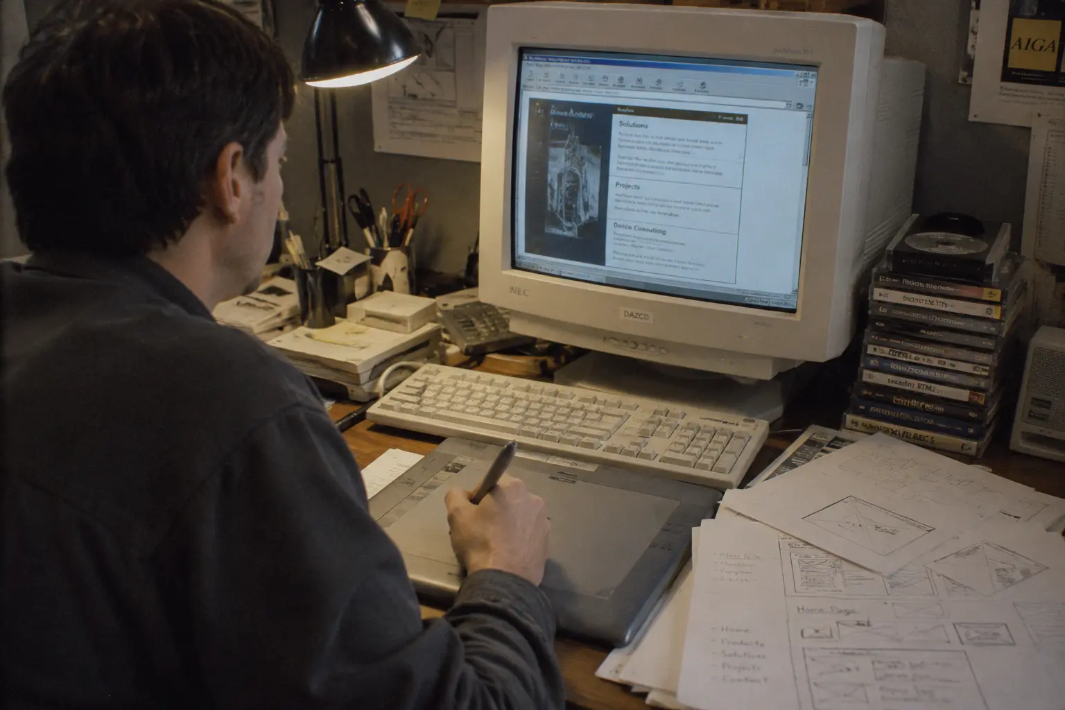
Designers wanted structure, so they used HTML tables, built for tabular data, as a page skeleton. Elements could finally sit side by side instead of stacking.
It worked and it cost. Markup grew heavy, pages loaded slowly, and every change meant fighting nested tables.
The aesthetic followed: animated GIFs, marquees, visitor counters, tiled backgrounds. Loud and hard to read, but it was the first time anyone asked how to present information rather than dump it.
Flash: Freedom With a Bill Attached
Flash arrived in 1996 and gave designers everything HTML could not: animation, sound, video, any shape, any typeface. Intro screens and fully animated sites defined what looked modern for a decade.
The costs stacked up. Flash sites loaded slowly, needed a plugin, behaved badly on mobile, and their content was effectively invisible to search engines.
In 2010 Apple refused to support Flash on the iPhone and published its reasoning. Adobe ended support in December 2020.
Flash is the most useful lesson in this history. Beauty that slows a site down, blocks access, and hides content from search loses, no matter how impressive it looks at launch.
CSS: Design Becomes Manageable
CSS arrived in 1996 and separated appearance from content. A whole site could be restyled from one stylesheet, and pages got lighter as table markup disappeared.
This is the quiet turning point of web design. Styling stopped being a set of hacks and became a discipline with real tools.
It also made everything later possible, responsive design included, because styles could finally react to the device. The engineering side of that shift is covered in what sites were built with.
Responsive: One Site for Every Screen
The iPhone launched in 2007 and broke every layout built for a desktop monitor. The first answer was a separate mobile site, which meant maintaining everything twice.
Ethan Marcotte named the alternative in 2010: responsive design. Fluid grids, flexible images, and styles that react to screen width. One site, every device.
Mobile then became the starting point rather than an adaptation. Designers began with the phone and expanded upward. When Google started demoting sites that were awkward on mobile in 2015, responsiveness stopped being optional.

From Imitating Reality to Flat
For years interfaces imitated physical objects: raised buttons, drop shadows, leather and wood textures. Then the pendulum swung.
iOS 7 shipped in 2013 with flat design: solid colours, simple shapes, clean typography, no decorative depth. It looked like a trend and it had a practical reason.
Flat interfaces load faster, scale across screen sizes, and read more easily. Same lesson as Flash: what won was not the more impressive option, it was the one that worked better.
UX: Design Is Judged by the Result
The deepest change was not aesthetic. Design stopped being about decorating a page and became about getting a person to their goal.
The questions changed. Is it obvious where to click. How many steps to checkout. Can someone find what they came for. Does it work on a slow connection or with poor eyesight.
So did the criterion of success. A beautiful store that does not convert is failed design. A plain one that moves people to checkout is good design. Accessibility joined the same standard, because different people use the same site.
Design Systems: Order at Scale
Once sites grew into products with dozens of templates, consistency broke down. Buttons differed page to page, spacing drifted, every new screen was drawn from scratch.
Bootstrap in 2011 and Google's Material Design in 2014 pushed the answer: a defined set of components with rules for combining them. Pages get assembled, not redrawn.
Figma arrived in 2016 and made those systems shared and live. Design became a predictable process with consistency, speed, and room to grow.

Today: AI, Speed, and Visibility
Three forces shape design now. AI tools generate layouts, imagery, and styling options in minutes. Core Web Vitals, a ranking factor since 2021, made speed and stability measurable.
The third is newest. When AI systems compose answers from sources, a site needs structure a machine can read. Design and structure became part of visibility, not just of impression.
The lesson repeats. A striking page that loads slowly, reads poorly, or cannot be parsed loses to a clear one, exactly as Flash lost to CSS.
The Test Every Design Has to Pass
Every era that bet on spectacle lost to the one that bet on clarity. Tables gave way to CSS. Flash died. Ornamental depth gave way to flat. UX set the criterion: the person reaches the goal.
So the question is not whether you like how the store looks. It is whether the look does five things.
- It moves a visitor toward the action, not just around the page.
- It loads fast enough to hold someone on mobile data.
- It is comfortable on a phone first, on a desktop second.
- It is structured clearly enough for search and AI to read.
- It has a face of its own, not the look of a template thousands of stores share.
We do design that is built to convert: modern, fast, readable to machines, and recognizably yours. Toronto.
Blog search
About the author